

Oh my dear dear blogging friends, you have been soooo incredibly faithful and patient with me these past weeks, and you SOOOO deserve more attention than I have been able to give you... my apologies!
Quickly, for an update on ScrapOrchard visit the Blog... Kami's post sums it up nicely. When there is more to report, I will do so immediately!!
So! Quite often I'm asked by you guys how to make things look more "real" in Photoshop, and honestly, there's not one simple answer - but I can tell you ONE quick and easy way that I use all the time.
The BURN and DODGE tool! Never heard of them? Well, silly you.. you've been missing out all this time! Just download the freebie template and follow along!
DOWNLOAD THE TEMPLATE HERE (password is scraporchard he he he!)
Ok, now use the template as you normally would, and if you need a template "clipping mask" tutorial review CLICK HERE to get you started. Keep in mind that for nice dramatic results for your paper curl you'll want to coordinate three colors or papers. The bottom paper (shown on the template in the darkest grey, (this will be the paper that is "revealed" by the top paper curling back. The top background paper which is the paper that will "curl" and the back of the top background paper, which is what you actually see as the curl itself.
Here is an example of the three papers (from my Butterfly Garden kit)
But do you see how they look "flat" and not actually curled? THIS is how your papers will look if you simply clip the papers to my elements in the template. Want it to look "more real? Then read on!!
First:
Go to your PS/PSE tool bar and look for these tools:
OR...you can simply press the letter O on your keyboard and it will pull up the last tool that you used from this flyout menu. (did pressing O not give you the tool you wanted? Just click on the little tiny arrow in the bottom right corner this causes the flyout menu to "fly out" LOL! and you can choose the tool you want.
Now select the DODGE TOOL (looks like a tiny push pin to me!) which "lightens" whatever it touches... and then you will choose a "brush" to apply the dodge tool with. Not sure how to do that? Well check this out! First select your brush tool and once your have your brush tool active, you'll need to choose your brush by going to the top of your tool bar and clicking on the flyout menu that says BRUSH. Your brush menu will now appear and you want to choose a large SOFT brush. What is a soft brush you ask? A soft brush will give you a softer, more blended edge and looks that way in your menu (as opposed to the harder darker brushes that give a sharp crisp edge). I chose the 500 brush, you choose the largest, softest brush in your pallet) now bring your cursor over the top of your page and you'll see a large circle that is your brush (don't see it? Make sure that the layer that you want to work on is selected, and your Caps Lock is off!)
Now, make your brush even bigger! (easy way to do this is to simply press your right bracket key -two keys right of the letter P! - make it smaller? That's right, just press the left bracket key) For my paper curl, I used a 700 pixel brush so I pressed the right bracket key twice.
Now, with your Dodge Tool selected and using your large soft brush I want you to make sure that the PAPER CURL layer is active (if it's blue, then it's active... if it's not blue, just click on the layer!) on your layers pallet and click ONE TIME on the top center of your paper curl as shown here
then create a straight line by simply holding down the shift key and clicking where you want your effect to end (I showed the approximate spot in the picture above). You don't have to worry about being "perfect" that's the GREAT thing about photoshop! Any mistake is just a Ctrl+Z for pc's or Command+Z for mac's away! -( pssst...that's a shortcut for UNDO!) So click then shift+click to create your line, or simply click and drag your brush if you'd prefer! If you want your highlight line to be brighter, simply repeat the dodge tooled line!
Please note: Depending on the color of the paper that you're working on, you might need different strengths for your tool, if the white line is too bright, simply undo and change the strength of your tool in the tool bar up top!
Your curl should now look something like this (sorry, LOL I changed papers for the curl, it isn't as cute as the flower paper, but it shows the tutorial better! he he he):
Now, if you want to take it a step further, and if your paper needs it... (mine doesn't so much because it was a darker colored paper, but lighter papers will need this further touch) Go back to your dodge tool and choose the BURN tool. Just the opposite of the dodge tool, the burn tool is going to darken whatever it touches. Using the same brush, you want to add some depth to your curl but brushing a straight line at the very back of the curl (where it meets the paper) and at the very tip of the curl (the corner of the paper) now you'll have something like this:
Now add the final touch of a drop shadow and this is what you'll have!

Looks more "real" right? LOL Enjoy your template and your tut... now back to the grindstone for me... I'm working on a new collab with Kami of Ziggle Designs, (and that Kami is such a slave driver!! he he he!)
By the way... Do you LOVE my Word Art? Yea, well it's NOT MINE... ! All the credit goes to Bethany of Elegant WordArt! A blog reader and new scrapper like many of you, Bethany "RAK'd" me with this GREAT word art and told me to feel free to share with all of you, so head on over to her blog (she has a TON of great FREE WordArt!!) Thanks Bethany!!
Ok... so this little Tut has taken me a bit longer than I anticpated...it's 1:30 a.m. here in Hawaii, so no time to double check for spelling or typos! You'll just have to live with them all!
Hopefully we'll see you all at the Orchard soon...hey... use the template if you want and post your layouts in the GALLERY!! THAT would make my day!
Aloha!
Shauna
Friday, April 11, 2008
A Template with a quick "Burn & Dodge" Tut!


Saturday, February 9, 2008
2.09.08 - Designer Template 01 and a Vent?

Ok, so I'm going out on a limb here and going to go with my originally planned post despite some not so nice emails today! (Can I vent a bit??) So, I'm feeling a bit like Penn and Teller at a magician's conference today (does anyone get that reference besides me? LOL) For those that don't, Penn and Teller are magicians that, during their show, often share how their tricks are done. Because of this they apparently aren't very well liked in the "magician community".
Soooo...back to the original reference...LOL... I got a few nasty emails today from "fellow designers" who "had concerns" that perhaps it would be in my "best interest" to simply continue with my "nicely designed freebies" and "discontinue" my "step-by-step tutorials". This, they basically said might "lessen the desire of digital scrapbookers to purchase not just" (my) "kits, but ALL my fellow designers kits in lieu of creating their own". In other words, if you learn how to use photoshop like "we" do, if I continue to try and share the little bit of knowledge that I have about photoshop, that THE SKIES WILL FALL, and ALL GRAPHIC DESIGNERS LIKE MYSELF WILL BE OUT OF BUSINESS!!! Seriously??? Are they out of their minds??? There are literally THOUSANDS of photoshop tutorials on the web, and granted, the majority of them are not for scrapbooking specifically, but HELLO... really? Little 'ol me is going to bring this HUGE industry to it's knees with my little blog??
The emails (THREE of them no less! A coincidence you think? I think not.) all basically started out nicely and then got somewhat nasty basically telling me that this was a "small community" and that designers needed to stick together and share these tutorials amongst one another, NOT the "general public" and that it would be bad for my blog and my business if I "upset other designers"... WHAT?? I'm still a bit stunned by it all, and confused, and to be honest....kind of giggly...are they crazy??
So anyway...to anyone still reading this post (especially my "fellow designers" who may be "upset" by my tutorials") I say... KISS MY BACKSIDE! (and, if I can make another suggestion.... GET A LIFE!)
NOW...to make matters worse, I recently had an idea for a (somewhat) new (at least new to me!) Idea for a product for my little store at Digital Candy... Designer Templates! In other words, templates that weren't just "sketches" or basic layout templates (NOT that there is ANYTHING wrong with those!!) but templates that go a bit further and include ACTUAL ELEMENTS to use with that template and on their own! So instead of drawn lines on a layer that say "replace with stitches" I would actually include the stitches... Instead of "add element" here, I would include an element that would go with that layout (and others), even papers that could be used for overlays if you liked the pattern...etc. (someone please email me if this is a booming industry already and I'm just an idiot that missed it somehow ok?? LOL)
So...that shouldn't be a problem right? EXCEPT that I thought all day about how I would word this post so that it didn't seem as though I was "slamming" those wonderful and talented designers who currently create some pretty darn great templates (like my dear fellow Candy Girl Chrissy W!! - luv you Chrissy!) I think that what they do is great! But I wanted to see how this would go over.... soooooo... then I got those lovely emails and thought...forget it! I can't post this today, I'll have an overflowing email box tomorrow from MORE "concerned designers" fearful that I would now take down the "template industry"!
OK - my rant is over. I've never backed down to a bully (even some slightly crazy ones if you ask me - I can't POSSIBLY be the ONLY designer out there who offers tutorials on my blog can I??) so, I'm putting up my first "designer template", I'm saying loudly and clearly that I LOVE my fellow designers, I LOVE those designers who make templates and I have no desire to bring this industry to it's knees by offering some help to my 700 or so loyal readers of this tiny little blog... I just want to share a bit of what I know and so I will continue to do so (don't hate me ok? I'm actually a pretty nice person! he he he!)
All right...here's my template... in .PSD and .PNG format... you can use the the stitches, the buttons and button stitches, the ornament and even the patterned paper if you really want to, on this template or other layouts as well! The elements are all in shades of grey so coloring them should be a breeze...(don't know how to color an element?) well then!! Please refer to my TUTORIAL ON RE-COLORING ELEMENTS that I posted on 12.31.07 OR Visit me tomorrow when I'll post an EVEN BETTER TUTORIAL on re-coloring more complex elements. HA! TAKE THAT NASTY LADIES! (he he he! By the way...did I mention that I'm stubborn and defiant? It is now my PERSONAL mission to make ALL of you PHOTOSHOP PROFESSIONALS!! LOL)
Enjoy the template...I did when I used it to create this layout of my baby boy and my dh sharing a moment on the beach a few years back. Like the papers and elements in my layout??? I WISH I could claim them as my own...but they are from the SMITTEN KIT by Kami of Ziggle Designs and Angela Niehaus...(two of our finest designers at DC) I have TRIED to refrain from purchasing other designer's kits, simply because, let's face it...I should be making my own instead... but I LOVE LOVE LOVE this kit and it's actually 20% off right now if you hurry up and get it. My layout doesn't really do the kit justice because the elements in this kit are TO DIE FOR, not to mention the papers... ANYWAY! Check out the kit, Download my template and if you would be so kind...let me know what you think of my idea for "upgraded" templates?? (please be kind...though k? I've had it rough here lately...if you hate it, just say...nope...hate it... I can live with that...LOL no, HATE HATE HATE IT YOU ARE STUPID STUPID STUPID...'cause that would just be uncalled for... he he he!)
Click HERE to download my new "Designer Template"
Click HERE to purchase Kami and Angela's TO DIE FOR "Smitten" Kit (or just to check it out!)
Click HERE to leave me a nice comment (nasty comments are limited to 3 words only he he he)
Tuesday, February 5, 2008
2.5.08 Template 02 in .PSD and .PNG file format

So I did a layout recently with a mini kit from Angela Niehaus for one of her Candy Jar Challenges and I liked the layout so much that I've created a template for you to scraplift it!
Again, my hat is off to those designers who make templates for daily freebies...it takes more work than one would think!
This particular template has a couple of goodies in it for you as well including a couple of the "paper curls" that are so popular in page layouts right now. I'll have a tutorial for you tomorrow on how to use these curls in other layouts, but for now just leave them as they are (don't clip any papers or anything on to them). I've left them on separate layers for easier use for you (and so that you can use them in other layouts as well!) You are also welcome to re-color the other elements like the fibers etc. and use them, but they are generally meant as examples for you to add your own elements and make this layout personal to your style!
Here is my original layout (using Angela's papers and elements) the picture is of my dd Emily many years ago in Wisconsin Dells! Thank you also to Atomic Cupcake for the flower brushes that I used for examples for other elements!
If you need help in using a template, please refer to my post on January 12th for a tutorial!
I'd LOVE LOVE LOVE to see what you do with the template, so PLEASE post your layouts at the Digital Candy Gallery and send me your link so that I can check it out!!
Enjoy!
Shauna
Click HERE to download your template!
Click HERE to visit me at Digital Candy
Click HERE to post your layout at the Digital Candy Gallery and show off all your hard work!
Friday, January 11, 2008
1.12.08 Winter Template Freeebie ( PSD and PNG) & TUTORIAL

Ok, Don't laugh, it's my first attempt at a template. I see them all over the digital scrapbooking sites, and they always look so plain, basic, blah... that's what I thought until I saw actual layouts done from templates and I was amazed!! I think it's pretty neat that you can "scraplift" a layout, but still have most of the creativity left to you!
So, I thought I would give it a shot and this is what I came up with! The template is above, and the LO that I did with it is here:
So, I had a couple of questions regarding how to use templates (which is what brought me to looking at them in the first place) so here goes: remember although the downloads come in PSD (photoshop format) and .png format, this tutorial is for PS and PSE users.
When you open your .psd file, you will see all of the layers for your template there. Using the template is so easy from here. Simply drag the file that you want to use to "clip" to the template onto a layer ABOVE the layer you want to clip it to as shown here:
Now that you have your background paper in your layer's pallet, above the layer holding the element you wish to "clip" it to you can apply your clipping mask. To do this, simply OPTION+CLICK (mac) or ALT+CLICK (pc) on the TINY little line between the to layers you want to join as shown here:
You will see the top layer indent a bit and your image will clip itself to the template below. TIP: the best part of this is that you can still "move" the paper, or picture or whatever you are clipping, around on the template so that you get exactly what you want to appear. With the indented layer selected simply click on the image in your main workspace and drag it around until you have it the way you would like it. Once you have it just so, you can MERGE THE LAYERS either by selecting the topmost layer you want to merge and then Command/Ctrl + E it will merge your layers up one level, or you can highlight both (or all layers you want to merge) and then clicking LAYER>MERGE LAYERS.
Simple as that! Now you'll continue doing this same process for each of the template elements that you wish to use in your layout. As you can see in my layout, I chose to use a different font and style for my title, so I simply turned off visibility of the title layer (click the little eye to the left of the layer thumbnail in the layers pallet) and then added my own! Another great thing about templates!!
LASTLY - if any of you are still reading... wonder where I got the papers and elements that I used in my layout?? It's another sneak peek of a new kit that I should have in the store by the end of the weekend, beginning of next week, called Old Man Winter!
Have fun with the template! If the downloads are high, I'll take that as a sign that you guys want more!!
Aloha!
Shauna
Download the .PSD file HERE
Download the .PNG files HERE
Thursday, December 27, 2007
12.27.07 Vintage Grunge Mini Kit +Template Tutorial

Well, I hope that your Christmas went as well as mine did! Between my 7 year old's reaction to his new Wii (I waited in line for 5 hours to get it, he BETTER be excited!) my 13 year old's excitement over her new MacBook laptop and my 15 year old's scream of joy over her new iPod and accessories, it was a merry Christmas all around (although, I've officially resigned as our family's, tech person after a Christmas filled with electronics, it was still better than the Christmas filled with Barbies, GI Joes and THOUSANDS of metal twist ties that took hours to free Barbie, Joe and all of their accessories!!)
So! On to another Freebie - I have finally come down to pilfering from some of my new kits that I'm designing for Digital Candy! LOL and this is a peek at my Vintage Grunge Kit - I really love mixing styles (elegant+grunge etc.) and this is a tiny glimpse of that!
The mini kit includes: 3 of my favorite grunge papers from the kit, a paper flower, a diamond stick pin, a small "memories" element and a library pocket with a template. I've had great response to my small tutorials, so here's another! This time I'm going to teach you an easy way to be able to place something "inside" of your library pocket (a great place for maybe some journaling on a tag or something!) Again, this tutorial is for Photoshop (PS) or Photoshop Elements (PSE). If you have any questions, feel free to email me at PineapplePlantation@gmail.com !
Ok - You'll need to take whatever you're going to place into the pocket, and the template I've enclosed (both in PS/PSE format and a .PNG format) and drag them both into a newly created document (so you keep the original of both individual items for later) that is larger than both of the elements to give you some room to work in. Be sure to create your new file with 300 dpi and with a transparent background.
Once you have both elements in the same file, make sure that the template (which, by the way, looks exactly like the top of the library pocket) is on a layer BENEATH the other element in the layers pallet (don't see the layers pallet? go to WINDOW>LAYERS and it should appear). TIP - resize your ELEMENT if you need to, NOT the template, as it is the exact size you need it to be when you put it on top of your pocket.
Now adjust your element by turning it, or moving it up and down etc. Everything above the bottom of the template will eventually show on your layout.
Once you've done this, then LOAD THE SELECTION of the template (done by doing a special click directly on the thumbnail picture of the template inside of the layers pallet - Ctrl+Click on a PC, Command+Click on a Mac) this should give you a bunch of "marching ants" around your template. Now click SELECT>INVERSE (select is found on the top menu bar). This allows you to work on everything EXCEPT the template inside of your file. If your pocket element does NOT go above the top of the template, you can simply click DELETE and everything outside of your template will dissapear, if your item DOES go above the top of the template, then simply use your ERASER tool (a nice round, hard brush with 100% opacity is perfect). Make sure that the layer with the ELEMENT is active since that is what you want to erase. Then erase everything below the bottom of your template. This creates the illusion that your element is inside of the pocket once you place the template on the library pocket.
By selecting the template and inverting the selection, it allows you to erase with ease, as it preserves everything INSIDE the marching ants, even if you run over it with your eraser, so you don't need to be careful about getting too close to the template or your element that will show (took me awhile to figure this one out, but it saves TONS of time!)
Now, DESELECT your template (Command D on a Mac, Ctrl D on a PC, or SELECT>DESELECT).
Now, while you have two different layers make any adjustments to the layers that you want (maybe add a drop shadow to your element so that it gives it dimension, maybe bevel or emboss it, whatever you like!) Once you merge the layers to add it to your layout you won't be able to make changes to JUST the element.
Once you're finished, simply merge your layers (SHIFT+Command or Ctrl+E to merge all visible layers) and ta da! You've got the top of your pocket finished! Now drag your pocket into this file, placing it BELOW the template and element in the layers pallet, align the two elements so that you can't see the top of the original pocket. Now merge the layers again and TA DA! You've done it!! Simply save your new finished pocket as a .PSD or .PNG file and drag it to your layout!
Please don't laugh at me, but I'm a visual learner so I've visually shown the steps in a photo below for those of you who, like me when I first began, was a bit lost with written directions!!! LOL
I hope this makes all makes sense! OL it's 3:00 a.m. Hawaii time and I'm a bit groggy! LOL email if you have questions, and have fun!
Shauna
Click HERE or on the title to download the Freebie!
Tuesday, December 18, 2007
12.19.08 Dear Santa Mini Kit + A bit of a RANT and a TUTORIAL!

Ok, first off - I know that I said that I should kill two birds with one stone and make my freebies some of the stuff that I'm working on for my new venture with Digital Candy, but I've been working on this Santa for some time now for a page of my mother on Santa's lap as a child and I was SOOO thrilled with how it came out that I had to share it with you. I also made a few items to go with it - a plaid page that matches the color of Santa's coat, a distressed parchment page, a little book with santa on one page and "Twas the night before Christmas..." on the other, and an ornate frame that seemed to me to go well with Santa - which brings me to my rant (in a weird sort of backwards way) I also made a photo template for the ornate frame which, IMHO (in my humble opinion) NOT enough designers out there do! And a quick page using most of the kit. Oh! And I also threw in the santa with NO coloring - in case you would prefer it that way! (here comes the rant part).
I've only been part of this community for a couple of months now, but I've found quite a few things that many designers don't do, and I'm a bit frustrated! When I started digital scrapbooking, I began to buy a few (OK OK, lots) of stuff from several stores. I quickly learned that quite a bit of the freebie kits out there were pretty hard to work with, and a few of the kits I purchased were too for that matter! There is only so much that a person can do with ribbons, bows, buttons and square frames! In addition, when I found a pretty frame that I liked, it was next to impossible to get my pictures to fit it (ergo, I assume the multitude of simple square frames). Why not put in the little blob that they used to "cut" the frame with? It wouldn't be that hard would it?
And in a kit, with some cute elements, quite a few of them were colored in such a way that I could only use them with certain papers, as they were too hard to re-color or "take apart" to use them with different kits etc. Can't they just "throw in" a blank frame or element, so that I can use it more often? (example - with my beaded ornaments, If I were a reader of this blog, I would have loved the little ornaments, but I think half the fun of downloading that little freebie would be to play with the beads and see what I, as a scrapbooker, could create with them) Whew! done with the rant LOL
Ok, so the good news is that I am going to try and NOT follow in the footsteps of those designers... I mean, anyone can re-color a ribbon or button right? (if you cannot, for goodness sake email me! You are spending WAY too much money on elements if so!! LOL)
Ok...back to the freebie (sorry for that...LOL...had to get it off my chest!!) Anyway, I put in my little "blob" so that you can use it as a template for your photo, that way it will fit in there perfectly with no overhang. If you don't know how to use the template feel free to email me with questions. I am really only familiar with Photoshop and Photoshop Elements, but it is really easy in those two programs. Simply use a clipping mask or, put the "blob" (hereinafter to be known as the template LOL)in its own layer and load the selection by clicking on the thumbnail of the template (Command+Click on a Mac, or Ctrl+Click on a PC) that creates a selection the shape of the template, then click SELECT>INVERSE. Then place your photo, or paper or whatever on another separate layer and activate THAT layer, then click Delete or Clear. By inverting the selection of your template you are telling PS or PSE to erase everything outside of that template. So whatever layer you activate, and then click delete (with the selection, or "marching ants") still active on, with end up in the shape of the template. A clipping mask is MUCH easier but as I have have only done this in PS CS3, I'm not sure that the directions for that are the same otherwise.
If you still need help, PLEASE feel free to email me at PineapplePlantation@gmail.com!
Ok... enjoy my little hand painted Santa, I REALLY do love him, (he's perhaps one my favorite elements I've ever created) and as always...if you would like to share a layout made with my stuff, PLEASE PLEASE PLEASE email them to me!! (Please??)
Much aloha my friends,
Shauna
*Sorry! This Link has been edited to be removed*
Friday, December 14, 2007
12.14.07 Merry & Bright Quick Page Layout + GREAT NEWS!!

So, great news first!! A few days ago I submitted the link to my little blog here to a great online store called Digital Candy to be on their creative team. (Click the name to check it out!) The owner of the site emailed me back to let me know that instead of being offered a position on their creative team, they wanted me to be an exclusive designer on their site! Can you believe that?? I haven't been doing this very long (less than 2 months) and then this!! So I signed the contract today and it's official! No worries though, I'll still have freebies for you every day, so please keep coming back! You guys have made this little blog a pretty big deal! Yesterday I had over 1000 unique hits to the site!
So anyway, what you want to know about...the freebie! LOL There's another great site out there owned by a really inspiring designer Katie Petiet called Designer Digitals. Every Sunday they give out Freebies and have challenges for you to use them and then post them in their gallery. I really liked the ones they had this past weekend, and I made a Quick Page out of them. If you want the original elements, feel free to check out their site and you can download them there. In the meantime the freebies that I have for you are: my QP and the elements that I created to go with it (the snowflake frame, a blank vine frame and the paper used for the background so that you can make a double page layout if you like!
Thanks again for all the comments and moments of shared laughter with my little 80's theme posts for the last two days!!
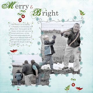
Oh! And here's the LO that I did with the QP (had to pick from the VERY few winter photos I have! this one is of my little Ethan's first snowball fight with Dad in Nebraska!
Much aloha -
Shauna
Click HERE or on the title to download